Manage dashboard
The Dashboard provides a clear, data-driven snapshot of your business’s performance, allowing you to monitor key metrics. The interactive charts help break down essential data, such as payment methods used (e.g., Visa, crypto), sales by country (e.g., Canada, Finland, France), and approval rates, allowing you to track trends and make informed decisions for future actions. To move the charts, simply drag and drop them to the desired position.
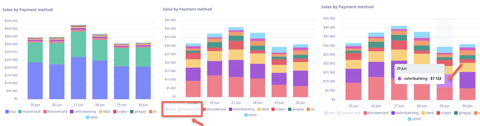
Sales by payment method
This section uses stacked column charts to visually represent sales over the last seven days, grouped by various payment methods helping you to quickly identify the most popular payment methods over the past week. You can interact with the chart by clicking on a payment method to exclude it from the results, offering a customized view of your data. For more detailed insights, hover over any part of the chart to see the exact sales amounts for each method on a specific day.
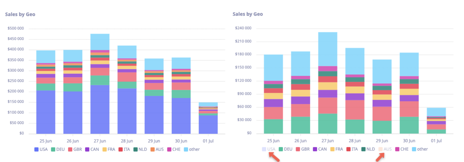
Sales by GEO
This section presents stacked column charts showcasing sales over the past seven days, grouped by geographical regions. This chart allows for easy comparison of sales performance across different countries or regions. You can interactively customize the view by clicking on a region’s name to exclude it from the results, providing a more focused analysis of specific locations.
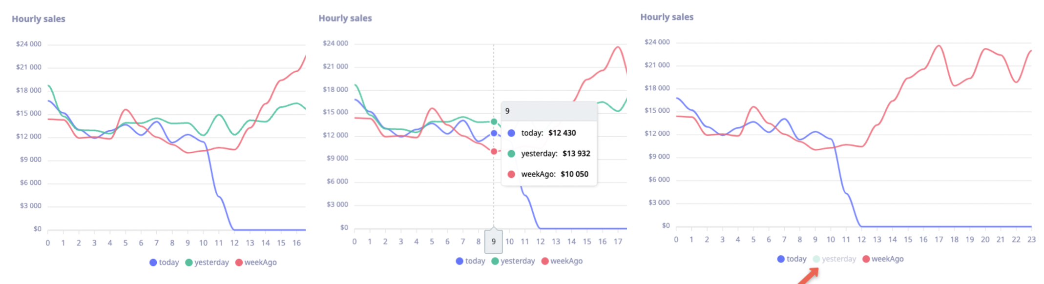
Hourly sales
This section features a curved lines chart that tracks sales amounts for the current day, allowing for direct comparison with yesterday and the same day from the previous week. This dynamic chart provides a clear view of sales trends throughout the day. To analyze specific time frames, you can hover over the lines to see precise sales amounts for each day and time. You can also interact with the chart by clicking on a day's label to exclude it from the display.
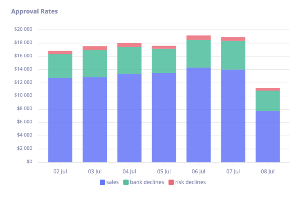
Approval rates
This section showcases a clear breakdown of how many sales were successfully approved, compared to those that were declined by the bank or due to risk factors. You can easily track approval performance over time and analyze patterns in sales success and declines within the given period.
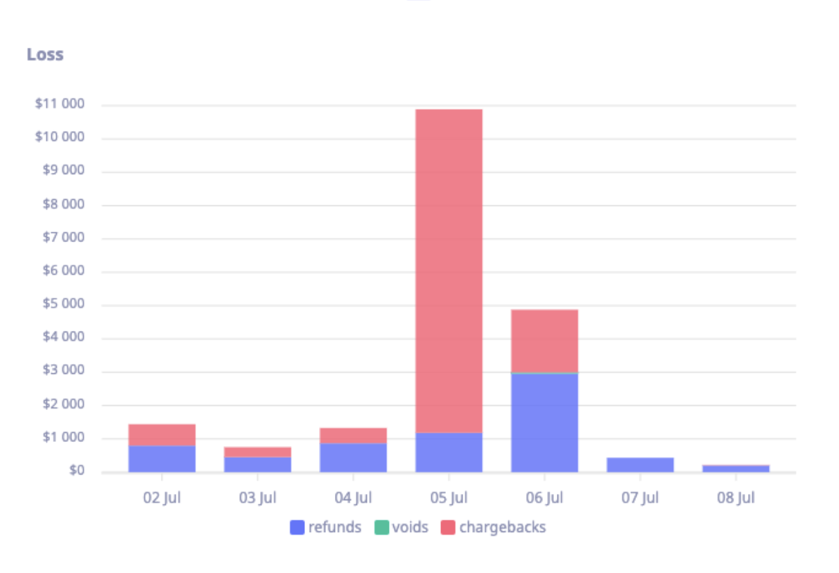
Loss
This section illustrates loss amounts over the past seven days, categorized by refunds, voids, and chargebacks. This visualization allows you to monitor financial losses and identify trends in how each type of transaction reversal contributes to the overall loss during the specified period.
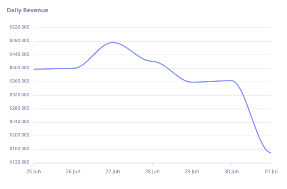
Revenue
This section presents revenue amounts, including both sales and settlements, over the last seven days. This chart provides a clear view of daily revenue trends, helping youu easily track changes in earnings and identify patterns across the week.